
How a Painter’s Heart Still Guides My Photography
I was twelve when I first fell in love with colour.
Not with photography.
Not with cameras.
With paint.
With the way ultramarine could quiet a restless canvas.
With the way vermilion refused to sit still.
With how the smallest touch of yellow could make an entire scene inhale.
Back then, I didn’t know about exposure triangles. I didn’t know about ISO or dynamic range.
I only knew that certain colours stirred something inside my chest.
A tightening.
A warmth.
A silence.
And I chased that feeling.
I would sit for hours watching how two shades reacted to each other,
how one colour could dominate,
how another could surrender,
how sometimes they fought,
and sometimes… they fell in love.
Years later, when I held a camera for the first time, I realized something quietly profound:
I was never learning photography.
I was translating painting into light.
Because before we see a photograph, we feel it.
And what we feel first…
is colour.
Colour Thinks Before We Do
Have you ever walked into a room and instantly felt calm?
Or uneasy?
Before you noticed the furniture.
Before you saw the details.
It was the colour.
Some shades soften us without permission.
Some energize us before we understand why.
Some command respect without raising their voice.
Colour moves faster than thought.
It reaches places logic cannot.
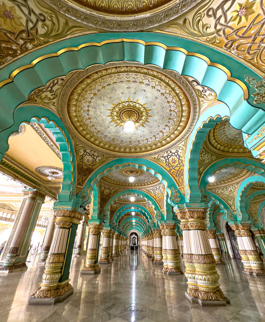
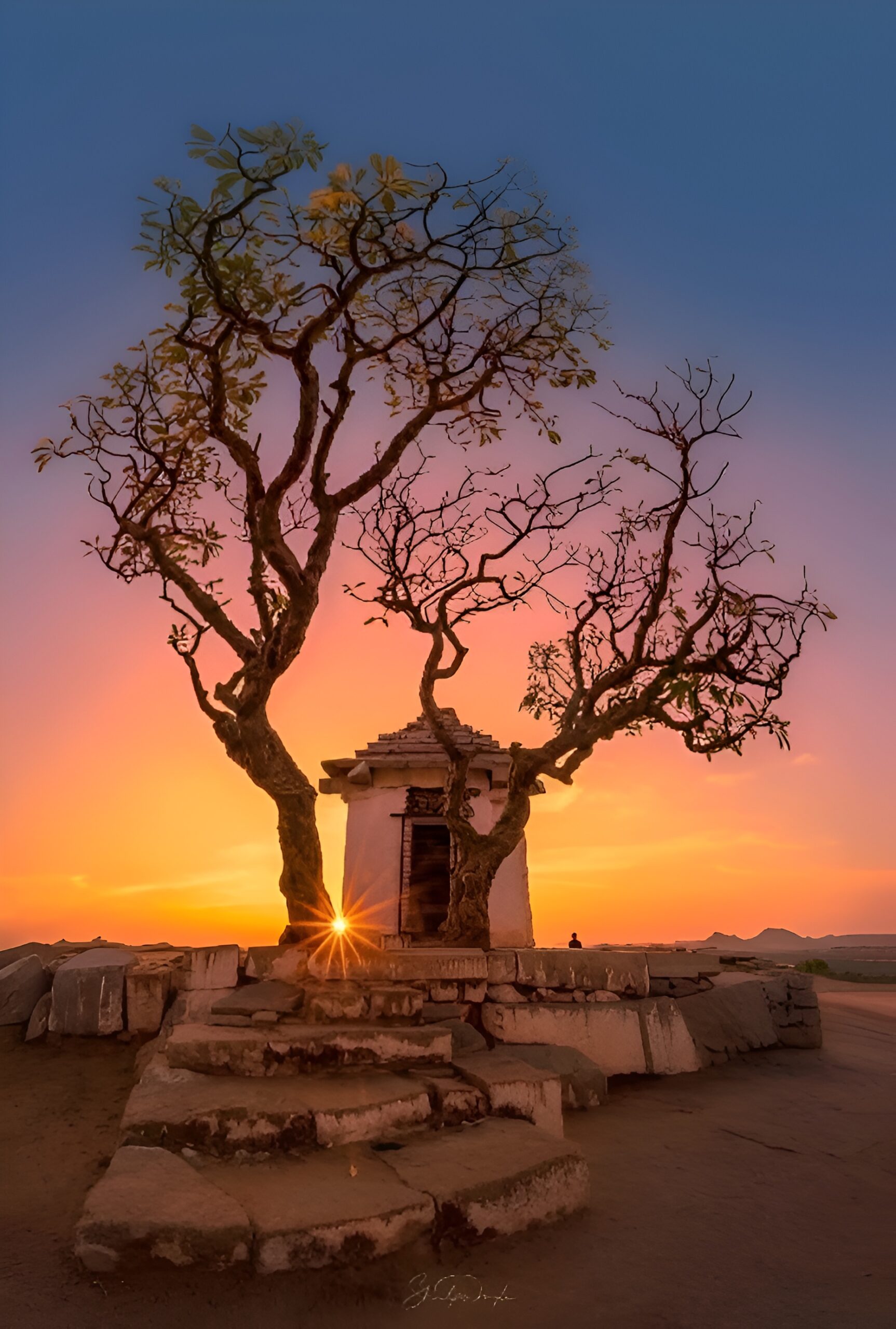
That is why certain temples feel sacred even in silence.
Why sunsets stop conversations.
Why a deep blue sky makes us breathe slower.
Why warm lights in a home feel like belonging.
When I photograph, I do not just look for subjects.
I look for emotional temperature.
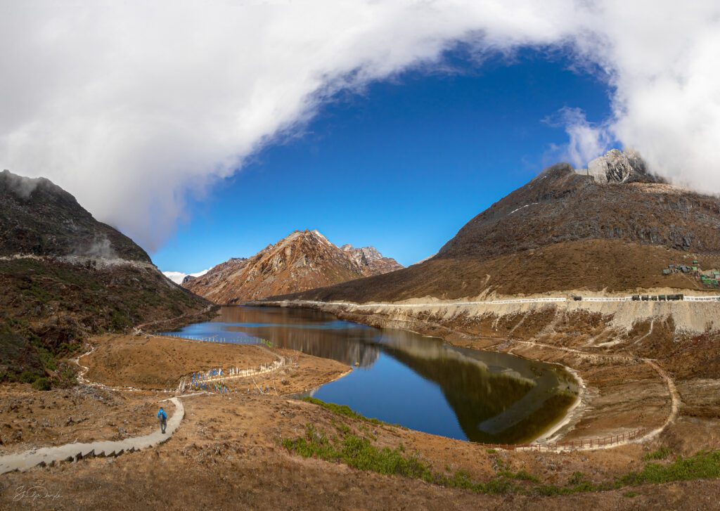
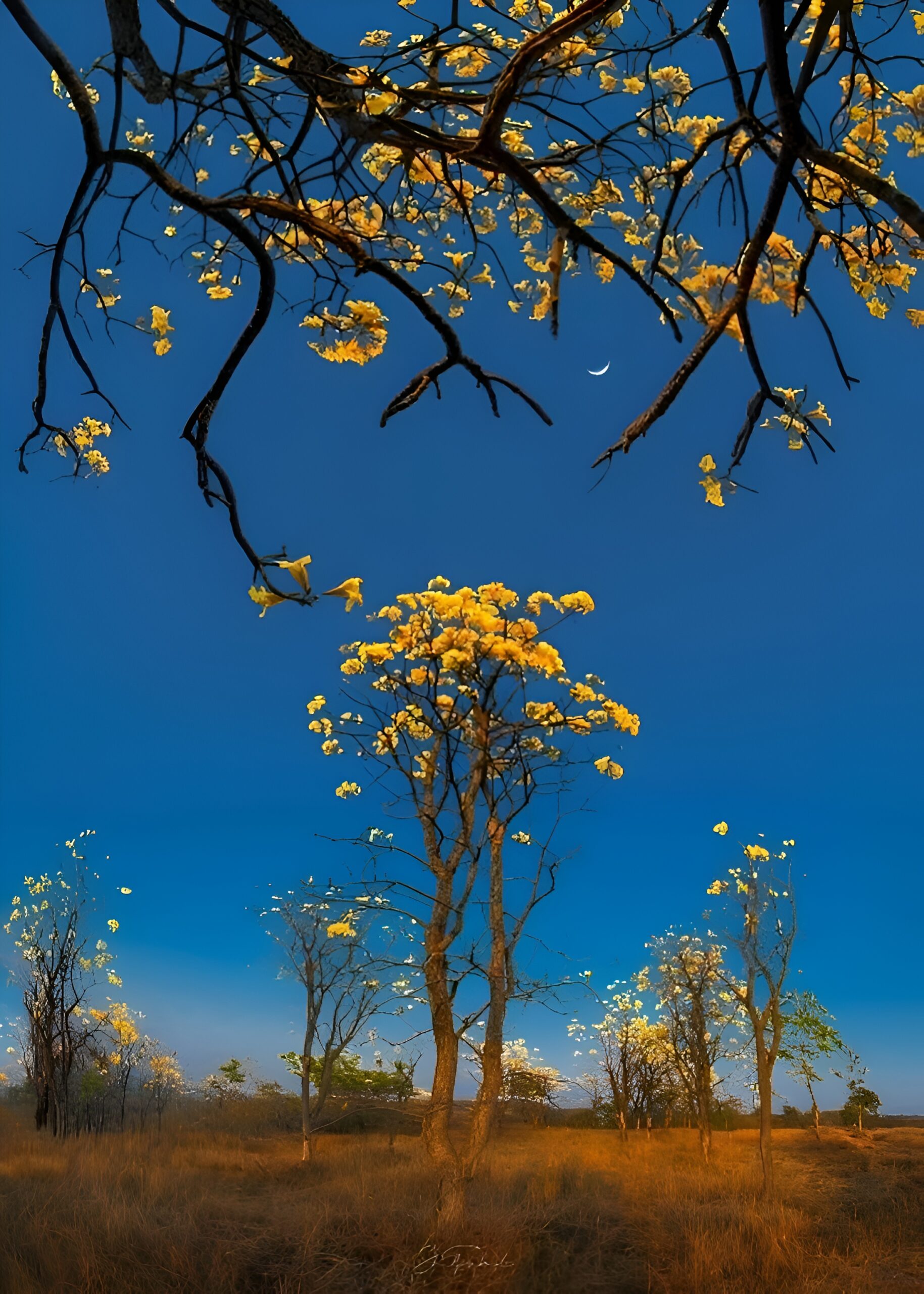
A cool blue sky creates space for reflection.
A deep red fabric carries intensity and presence.
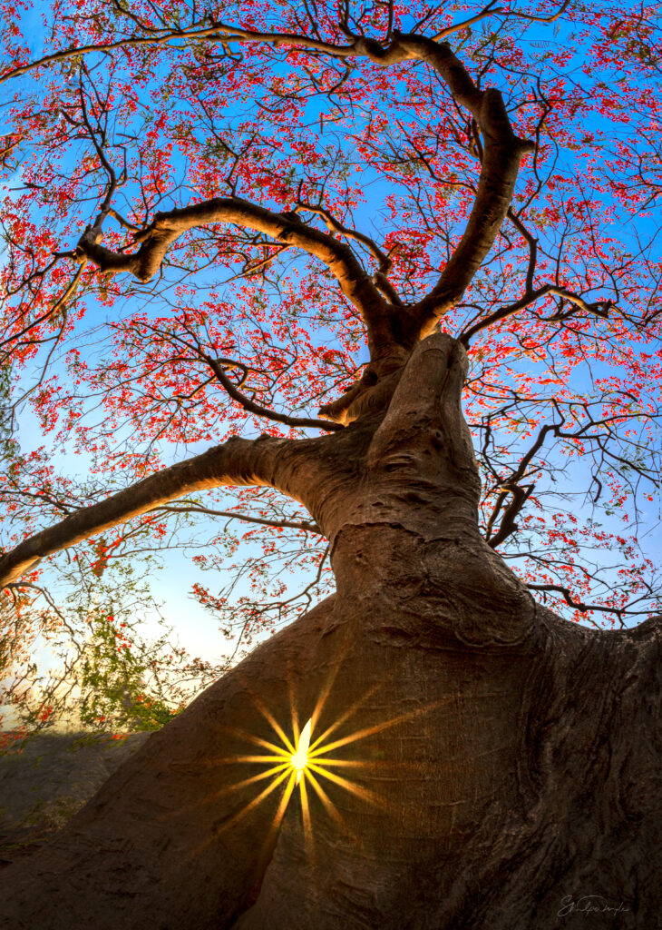
Golden light wraps a portrait in nostalgia.
Muted greys feel like whispered truths. Colour is never decoration.
It is direction.
The Way a Painter sees a Frame
When I frame a photograph, I am still that twelve-year-old girl with paint on her fingers.
I do not begin with the camera settings.
I begin with questions.
Where is the emotional weight?
Where does the eye want to rest?
Where is the tension?
Where is the silence?
Painters understand something photographers sometimes forget:
Too much colour can overwhelm.
Too little can starve the story.
Balance is not technical.
It is emotional.
Before I press the shutter, I ask myself:
Is this frame breathing?
Is the colour supporting the subject — or overpowering it?
Is the light honest?
Because if colour and story are not aligned, the image may look perfect — but it will feel empty.
And I cannot accept emptiness.
8 Ways I Let Colour Guide My Photography
Not formulas.
Not trends.
Instincts refined over years of observing, failing, experimenting, feeling.
1. Compose With Emotion Before Geometry
Grids matter.
But emotion matters more.
If a woman in a red sari stands against a green field, the conversation has already begun.
Contrast creates rhythm.
Harmony creates comfort.
I let colour lead the eye before lines do.
2. I Respect Harmony… But I Welcome Tension
The colour wheel taught me balance.
Art taught me courage.
Sometimes harmony soothes the viewer.
Sometimes tension wakes them up.
A clash is not always a mistake.
Sometimes it is truth.
3. I Allow Bold Colours to Be Bold
There are moments that demand strength.
A vibrant marketplace.
A confident executive portrait.
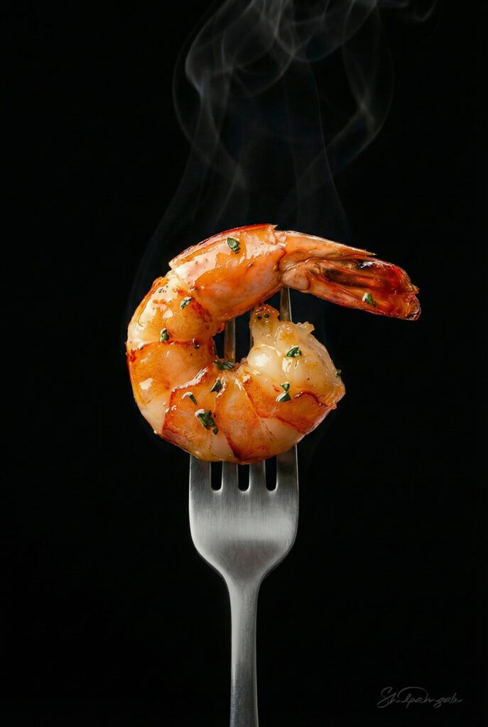
A rich plate of food glowing against dark wood.
Bold colour carries authority.
But authority must be intentional — not accidental.
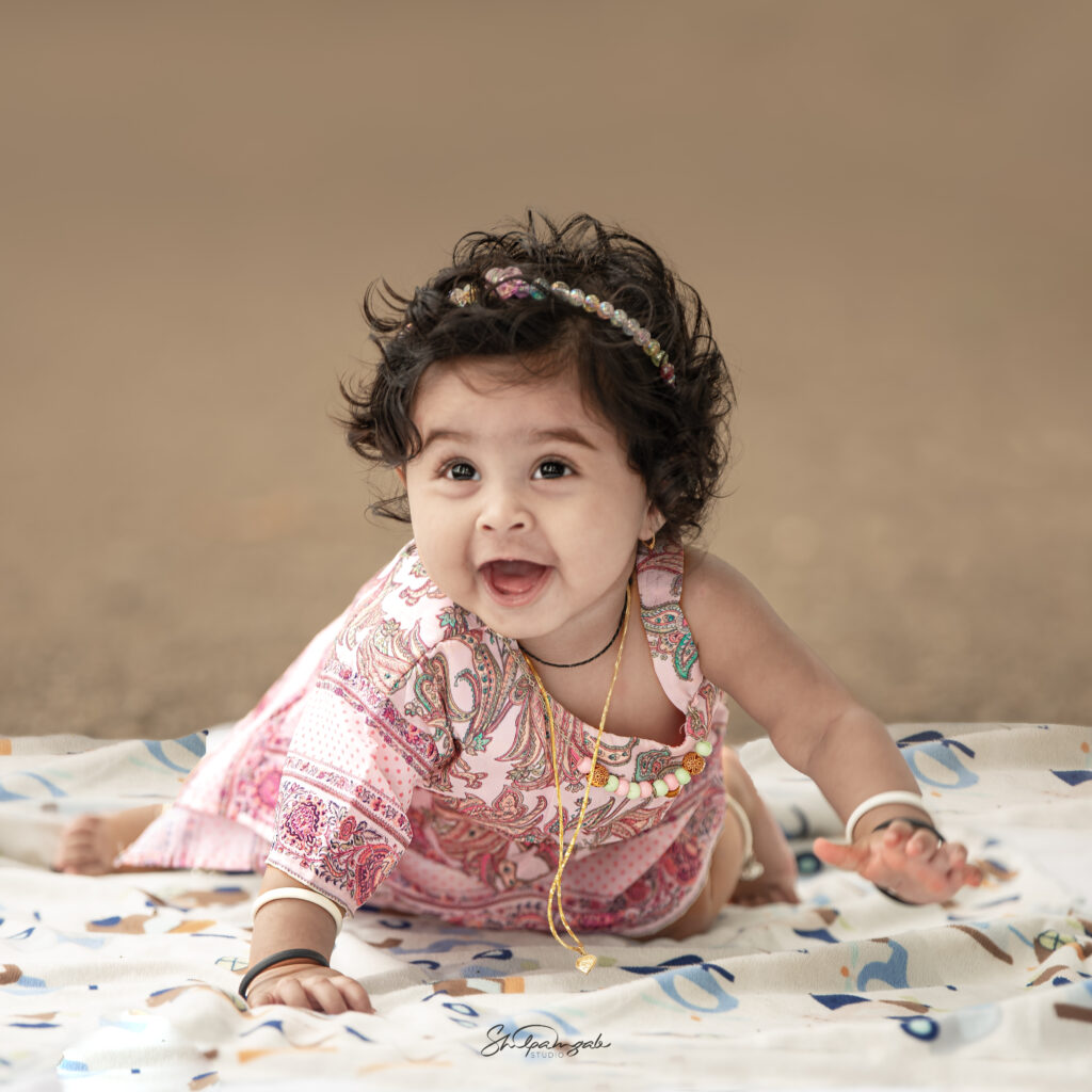
4. I Trust Soft Tones With Tender Stories
Pastels feel like whispers.
They work beautifully with babies, quiet interiors, early mornings and gentle love.
Soft colours do not demand attention. They invite connection.
And invitation often creates deeper intimacy than intensity ever could.
5. I Listen to What a Colour Is Trying to Say
Red is not always romance.
Sometimes it is devotion.
Sometimes it is power.
Sometimes it is warning.
Blue is not always calm.
Sometimes it is longing.
Distance.
Memory.
An artist does not label colour.
She listens.
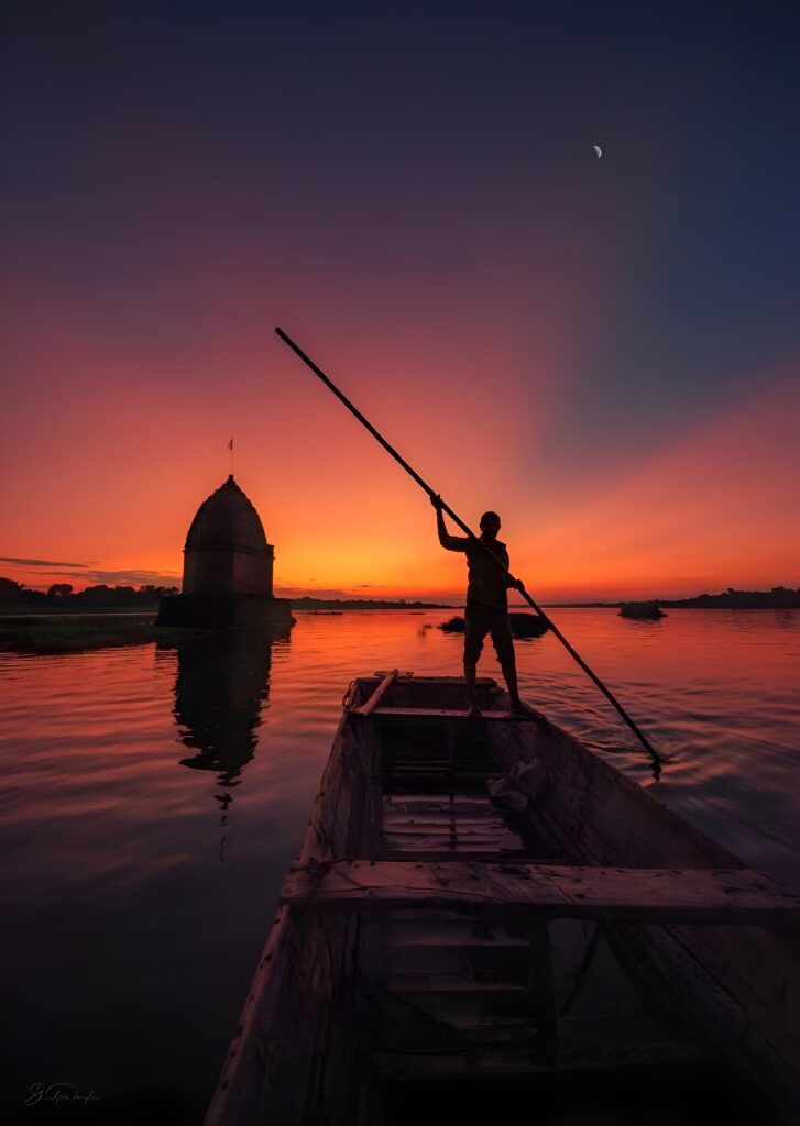
6. I Treat Light Like Liquid Paint
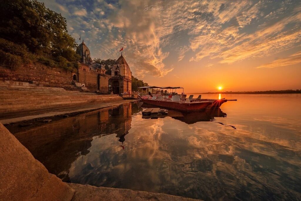
Golden hour is not just warm light.
It is memory.
Cool twilight is not just blue.
It is reflection.
When I adjust white balance, I am not correcting temperature.
I am shaping emotion.
Light carries colour.
Colour carries feeling.
And feeling carries story.
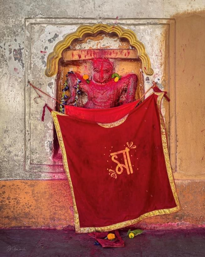
7. I Sometimes Let One Colour Take Over Completely
Monochromatic frames feel decisive.
An earthy interior wrapped in beige.
A portrait immersed in deep shadows and blues.
A temple bathed entirely in amber glow.
When one colour dominates, the message becomes clear.
There is power in restraint.
8. I Edit the Way I Once Painted
Colour grading, for me, is not following trends.
It is finishing the canvas.
I soften shadows where I want vulnerability.
Warm tones where I want belonging.
Deepen contrast where I want strength.
Consistency in colour is not just branding.
It is memory.
When someone recognizes my photograph before reading my name,
That is not algorithm.
That is emotional imprint.
Why We Lean Toward Certain Images
We believe we choose photographs logically.
We don’t.
We pause where something inside us feels understood.
We scroll past hundreds of technically perfect images.
Then one makes us stop.
We don’t always know why.
But something in its colour felt familiar.
Safe.
Powerful.
Nostalgic.
Alive.
Colour speaks to parts of us that existed long before we had words for them.
As an artist, my responsibility is not just to capture beauty.
It is to guide emotion honestly.
To create images that do not shout,
but stay.
From Canvas to Camera
When I painted at twelve, I did not know I was training my eyes.
I was learning:
Patience.
Restraint.
Balance.
Courage.
Sensitivity.
Photography did not replace painting. It expanded it.
The canvas became the world.
The brush became light.
The pigments became moments. But the heart remained the same. I still chase that quiet pause.
That fraction of a second when a viewer forgets technique and simply feels.
That is when art happens.
The Invisible Thread
Every photograph carries an invisible thread between artist and viewer.
Colour is that thread.
It moves silently.
It connects instantly.
It lingers long after the image disappears from the screen.
So if you truly want your photography to stand out,
Do not start with the camera.
Start with sensitivity.
Train your eyes the way a painter does.
Let creativity shape structure.
Let emotion shape editing.
Because when art leads and technique follows,
The image does not just look beautiful.
It becomes memory.
When Passion Found Its Purpose
Today, colour is no longer just something I see.
It is something I sense.
What began as a child’s fascination with pigments has become the quiet compass of my profession. Every frame I create is guided by that same instinct, to feel first, then capture.
Photography did not take me away from painting. It allowed me to paint differently.
Now, I paint with light.
I paint with moments.
I paint with emotion.
Colour is no longer just my passion.
It is the language through which I serve, create and connect.
Let’s Tell Your Story – Contact Us Today